Embedding a Svelte Component in HTML
Svelte and related frameworks build components that can be reused across a website. HTML5 supports a similar idea called Web Components that allows developers to create reusable components. However, there is some complexity involved in using them. Fortunately, if you know Svelte, you can generate these web components directly from a Svelte component! This allows your useful components to be used in any website.
We’ll do this with the Calculator component we built on the previous page. The heavy lifting has been done for us. We’ll use a package put together by the Polish developer Dariusz Sikorski. My gratitude to him for providing immediate help to me, updating his site when I encountered a couple of problems with it.
Begin by creating a directory called calccomp, and navigate to it with your terminal. Then enter the following command:
npx degit https://github.com/dariuszsikorski/svelte-webcomponent .
This downloads just the latest version of each file.
Now take a look at what you have downloaded. I suggest using VS Code for your edits—it’s free and works well on Windows, Mac, and Unix. You can download it at https://code.visualstudio.com/download. Then click on the image of four squares with one rotated (on the far left) to bring up extensions, and search for and install Svelte for VS Code and Svelte Intellisense. From the menu, choose File / Open Folder and navigate to the calccomp directory you have created, and hit Enter to bring it up. If necessary, click on the top left button (two sheets of paper) to bring up the explorer, and you can see the files you have downloaded in the left panel. VS Code is a wonderful and powerful tool, and if you are new to it, it’s worth spending some time learning how to use it before continuing.
This package ships with a minimal example component called my-component defined in a file named src/wc/MyComponent.svelte. If you want, you can see what he has done. First, install needed packages. In your Terminal session run npm install and then run npm run dev and you will see a page with his component. The code for this page is at src/App.svelte. You may need to navigate to the page shown on your terminal to see it, although it comes up automatically on my Mac. Hit control+C (Mac or Unix) or Ctrl+C (Windows) to terminate the session. Then, from Terminal, run npm run build to generate the code you will need for running in HTML. You can see a preview by running the command npm run preview and again, navigating to the address given if it does not show up automatically (that’s localhost:8080 on my Mac).
You will see a different web page, built from the file preview-index.html.
Now let’s replace his files with our Calculator component. The CalcUI file won’t be a web component—it’s just a helper. Copy that file and save it as CalcUI.svelte under src/lib.
Files that should be web components go in the src/wc directory. They also need to be renamed. Copy Calculator.svelte to that directory, and rename it Calculator.wc.svelte. Remove his MyComponent.wc.svelte.
We have to make a couple of edits to our Calculator.wc.svelte file. At the very top, add the following line: <svelte:options customElement="calc-ulator" /> This gives a name for the custom element. Remember it must be lower case and have a hyphen.
Second, our import of CalcUI.svelte needs to point to its current location. Change the import statement to be like this: import CalcUI from '/src/lib/CalcUI.svelte';
Next, we need to modify the files that display our component. The dev file is src/App.svelte. Replace all the code in that file with the following:
<script lang="ts">//
import './wc/web-components'; // This will trigger registration)
</script><main>
<h1>Custom Element</h1>
<h2>Calculator</h2>
<!-- Use your custom elements -->
<calc-ulator></calc-ulator>
<h2>A Smaller Calculator</h2>
<calc-ulator fontSize="12px"></calc-ulator>
</main>Next, the preview code needs to be changed. Open preview-index.html and replace the code with the following:
<!doctype html>
<html lang="en">
  <head>
    <meta charset="UTF-8" />
    <meta name="viewport" content="width=device-width, initial-scale=1.0" />
    <title>My Web Components Preview</title>
    <style>
      body {
        font-family: -apple-system, BlinkMacSystemFont, 'Segoe UI', Roboto, 'Helvetica Neue', Arial, sans-serif;
        margin: 0;
        padding: 20px;
        background: #f5f5f5;
      }
      main {
        max-width: 800px;
        margin: 0 auto;
        background: white;
        /* padding: 30px; */
        /* border-radius: 8px; */
        box-shadow: 0 2px 8px rgba(0,0,0,0.1);
      }
      h1 {
        color: #333;
        margin-top: 0;
      }
      h2 {
        color: #666;
        font-size: 18px;
        margin-top: 30px;
        margin-bottom: 15px;
      }
      .demo-section {
        margin: 20px 0;
        padding: 15px;
        background: #fafafa;
        border-left: 3px solid #FF3E00;
        border-radius: 4px;
      }
      code {
        background: #f0f0f0;
        padding: 2px 6px;
        border-radius: 3px;
        font-family: 'Monaco', 'Menlo', monospace;
        font-size: 14px;
      }
      .info {
        color: #666;
        font-size: 14px;
        margin: 10px 0;
      }
      .success { color: #2e7d32; }
      .error { color: #d32f2f; }
    </style>
</head><body>
<main>
<h1>WB Web Components Preview</h1>
<p>Production-ready web components built with Svelte 5 and TypeScript.</p>
<h2>Calculator Custom Element Demo:</h2>
<div class="demo-section">
<calc-ulator></calc-ulator>
<p class="info">Component loaded from: <code>my-web-components.es.js</code></p>
</div>
<h2>Smaller Calculator Custom Element:</h2>
<div class="demo-section">
<calc-ulator fontSize="12px"></calc-ulator>
<p class="info">Component loaded from: <code>my-web-components.es.js</code></p>
</div>
<h2>Component Usage:</h2>
<div class="demo-section">
<p>Use this component in your HTML:</p>
<code><calc-ulator fontSize="XXpx"></calc-ulator></code>
<p class="info">Supports attributes: <code>name</code> (string)</p>
</div>
<h2>Import Methods:</h2>
<div class="demo-section">
<p><strong>ES Module:</strong></p>
<code>import { Calculator } from './my-web-components.es.js';</code>
<p><strong>UMD:</strong></p>
<code><script src="./my-web-components.umd.js"></script></code>
</div>
<h2>Component Status:</h2>
<div class="demo-section" id="debug-info">
<p class="info">Checking component registration...</p>
</div>
</main> <script>
setTimeout(() => {
const debugEl = document.getElementById('debug-info');
const componentClass = customElements.get('calc-ulator');
const myComponentEl = document.querySelector('calc-ulator');
if (componentClass) {
const elementInfo = myComponentEl ?
`<p class="info">✓ Element in DOM: <code>${myComponentEl.outerHTML.substring(0, 50)}</code></p>` :
'';
debugEl.innerHTML = `
<p class="info success">✓ Component registered successfully</p>
<p class="info">Custom element: <code>Calculator</code></p>
<p class="info">Tag: <code><calc-ulator></code></p>
${elementInfo}
`;
} else {
debugEl.innerHTML = `
<p class="info error">✗ Component registration failed</p>
<p class="info">Check browser console for errors.</p>
`;
console.error('calc-ulator failed to register');
}
}, 500);
</script>
</body>
</html>We’re almost done! Open the file web-components.ts and replace its code with the following:
// Import your web component Svelte files
import Calculator from './Calculator.wc.svelte'
// (Optional) If your .wc.svelte files use <svelte:options tag="...">,
// they register themselves on import. Otherwise, you can register manually:
// customElements.define('my-component', MyComponent);
// Export them so they can be imported elsewhere if desired
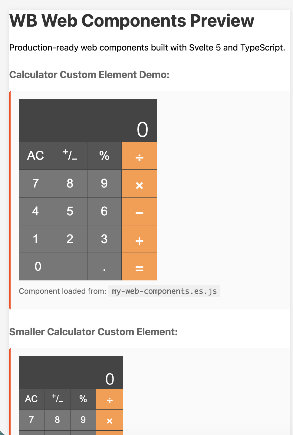
export { Calculator }Now we’re ready to try it out. First, enter npm run dev into your Terminal, and make sure the Calculator componet shows up. Hit Control+C to break and enter npm install again to update the generated files. Then try npm run preview and navigate to the requested URL It should generate the page whose screenshot is at the top of this post. If so, success!
You might be tempted to double-click on the file index.html in the dist directory, but don’t bother—you will get the following error message: Cross-Origin Request Blocked: The Same Origin Policy disallows reading the remote resource at [file address]. If you want to see it work locally in your browser, install http-server (if you don’t already have it) by entering npm install -g http-server. Then run http-server dist and navigate to the requested location, like http://127.0.0.1:8081
Now you have a relatively tiny file (36KB on my computer) that contains your Calculator. You can include it in any HTML file the same way it is included in /dist/index.html, by including the line <script type="module" src="./my-web-components.es.js"></script> (you must include type="module") and then embedding the call to it in your HTML like
Congratulations! Now we’re ready to move on to looking at SvelteKit!